• Timeless design is not about a fixed aesthetic, it rather reflects the brand's experience and its evolution over the years.
• The initial investment in strategy and identity contributes to the creation of a enduring brand that can grow and expand over time.
Throughout our experience, we've observed that the best path for a brand is one that allows for continuous evolution and development, always rooted in its foundations or initial identity. This enables easy acceptance of new products and services, as they come with a well-established history of the brand.
Each time we purchase something we regularly consume, Is there a decision-making process if it has maintained its quality and performance over time? The process of this purchase has became something natural, integrated into our small culture and rituals.
The same should happen with your brand if you have clear objectives and a long-term vision. Brand creation goes beyond the graphic aspect, its name, or its logo. It's about what it represents and the experience a person has in each interaction, purchase, content, and service provided.
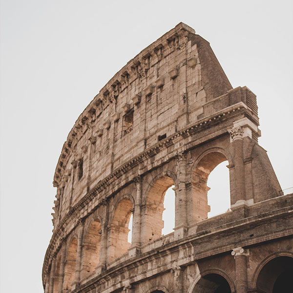
So, how could we define “being timeless”? Initially, it may seem something not tied to a specific time. However, we believe the correct interpretation in terms of identity is somewhat different: it doesn't specify its time not because it can't be associated with a specific moment, but because it transcends time. Its existence aligns with the present, the future, and even the past. Unrestricted by trends or time, it leaves a lasting impression.
The simplicity of communications, usage, or implementation makes it enduring. Consider contemporary elements that have persisted over the years: many were developed drawing inspiration from nature. Interior design based on simple lines and natural materials (wood, granite, marble, stone) endures, providing a sense of home. In industrial design, airplane shapes still mimic the initial form of birds with wings. It is reflected on another mean of transport: the car and its driving form. While safety and comfort advancements have occurred over the years, the essence of the automobile remains the same: a steering wheel and pedals.
In today's world, it would seem absurd not to have certain comforts or essential goods. Our brand must achieve the same. For this, it's crucial to be aware of the customer needs and market fluctuations to evolve and be ready to address new challenges.
Being functional, distancing from superflous trends that only bring momentary changes to our lives, using resources rationally, and implementing changes safely and without causing disruption in our customers' buying process will help us to transcend over time.
In a constantly evolving world where aesthetics come and go, achieving transcendence and resilience is a great quality that cultivates our personal style. It means offering a warmth and a secure option that will always be there for those who know us, whether they are current or potential customers.
Being timeless, being classic makes it easier to our interlocutor's cognitive system to understand us, making communication more direct and requiring less energy to comprehend us. "Doing things to endure" is about thinking in the medium and long term. It's about consciously investing in actions with detailed information and intention to grow or maintain what has been developed. It's about providing that support over time to our customers.
Thinking about sustainability, recycling, or other green initiatives is ineffective if they cannot be applied or sustained over time. It's better to implement sustainable changes gradually than invest in a structure that cannot endure.
And what about the logo? What makes it timeless?
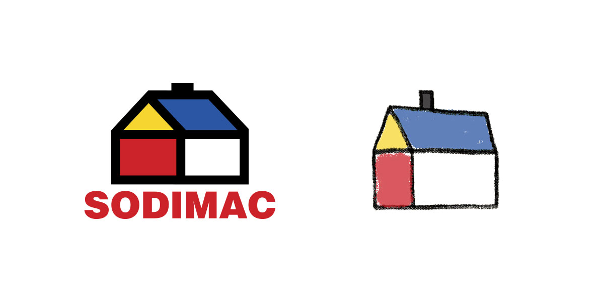
A timeless design embodies aesthetics, relevance, and lasting utility. It remains relevant over time, causing admiration regardless of when it was created. A design transcends time when it is simple and relevant, intrinsically connected to its identity and personality. Its aesthetics (color, typography, style, visual effects) should be applicable over a long period and not subject to passing trends. Similarly, it should adapt to various digital, print, or simple mediums. It should be easily reproducible, and it's said that even a child should be able to draw it. Consider the example of Sodimac's logo:

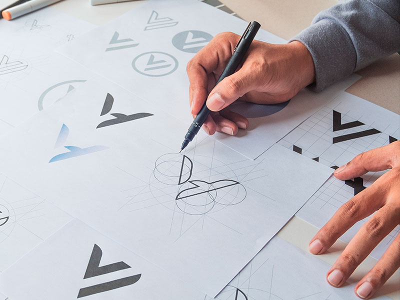
Let's not forget that, as we've been analyzing, the logo is part of the brand identity, so it should be designed to last for years without the need for updates or changes. It's crucial to keep it simple, away from passing aesthetics that might anchor it to a specific time. It should be easily distinguishable among other logos in the same industry. Understanding the target audience and ensuring the logo aligns with it is crucial.


